Visualisations for healthcare stakeholders

Whether you’re communicating with NHS staff, the Department for Health or other healthcare policymakers, data has a crucial role to play.

It has a part to play in getting their attention in the first place, helping to secure that meeting with eye-catching and relevant statistics.

And then in underlining your case at meetings and events used evidence backed and localised data points.

“Polimapper has helped us take a more tailored approach to planning meetings and events with stakeholders”

– Young Lives vs Cancer

Made for healthcare communications

Polimapper is perfectly suited to communicating with a range of healthcare stakeholders, featuring:

  • Ease of navigation to ICB, sub-ICB, local authority and parliamentary constituency dashboards
  • Clean and simple interactive map visuals for healthcare stakeholders to understand on first glance
  • Dashboards hosted on unique urls for ease of sharing

Types of healthcare data visualised

Say goodbye to overtly complicated dashboards

In healthcare, Polimapper is most commonly used to visualise the following types of data:

  • Prevalence of a particular disease, or disease 
  • Waiting times data, measured against targets
  • Availability of specialist staff
  • Locations of treatment centres, hospitals and research facilities

Visualise healthcare data by

Polimapper has a range of map templates to suit healthcare projects aimed at different stakeholder sets, including:

  • ICB/Sub-ICB
  • Local authority
  • Westminster parliamentary constituency
  • Scottish parliament, Welsh Senedd

How healthcare clients use Polimapper

Stakeholder Connect is a versatile web-based service that is equally at home:

In 1-2-1 meetings with healthcare stakeholders

On touch-screen TVs and ipads at industry exhibitions or political conferences and events

As a key geographical resource within your website

As a password protected data portal

Case Study:
How Nationwide demonstrates its branch commitment to MPs

Hear how Polimapper has made it much easier to present relevant data in a clear, impactful way, helping us showcase not only local-level insights but also the broader national picture.

View case study

No code and easy embedding

Use Polimapper Stakeholder Connect to create engaging visualisations:

  • Without the need for graphic designers
  • Without the need for web developers
  • It can easily be embedded seamlessly into websites in a format to suit you using our custom embed code generator.

Self-serve or managed options

Polimapper is designed to be a self-serve tool, enabling you to create visualisations quickly, as and when you need them.

However, if you’re looking to save yourself even more time, the Polimapper team can take care of everything for you – from sourcing data to building the visualisation.

Our managed packages can also be used for the creation of PDF data summaries.

Sourcing healthcare data

There is plenty of healthcare data in the public domain, which can be freely used for stakeholder communications.

It is typically collated at ICB or sub-ICB level, and sometimes at local authority level.

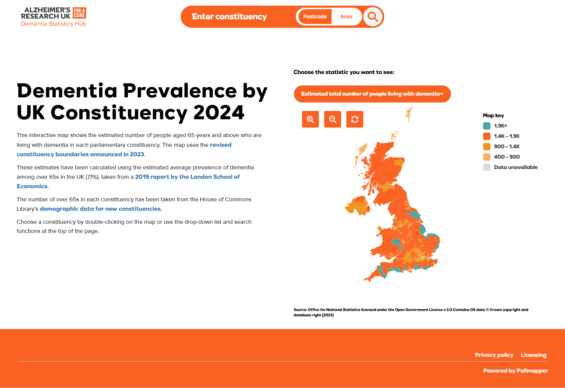
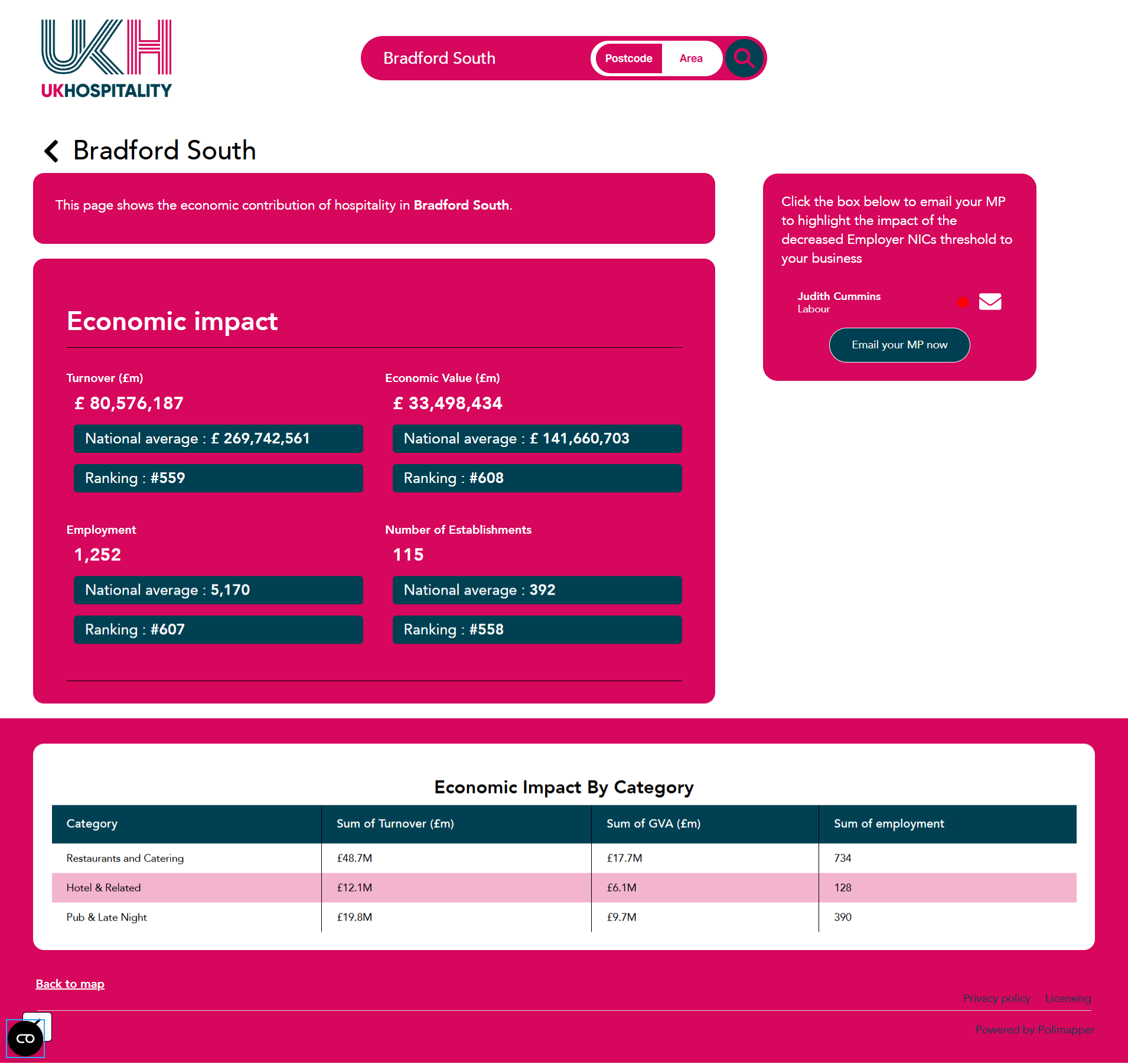
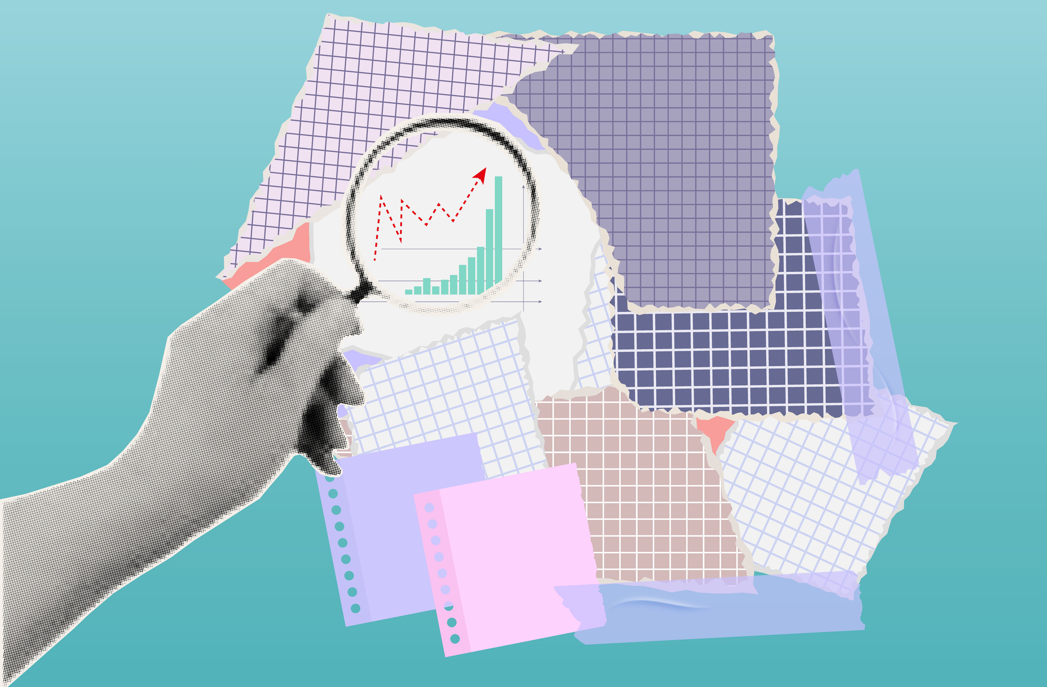
If you’re looking to reach parliamentary stakeholders then finding raw data that fits these boundaries is more challenging. However, data in other geographical formats can be adapted to provide constituency level estimates.

Equally if the data you’re seeking isn’t yet in the public domain, it can be possible to obtain it through freedom of information requests.